

NHS
Intranet redesign
Sussex Partnership NHS Foundation Trust delivers mental health services to over a million patients a year. Its intranet was twelve years old, clinical staff routinely could not find information and systems they needed or worked from old versions that were out of date, creating high clinical risk environment.
- Users
- Clinical and corporate staff across the Trust
- Ownership
- Taxonomy, structure, homepage and priority areas
- Role
- Sole designer
Approach
I mapped the existing site structure and used Google Analytics to identify the high-traffic areas, which gave me a sitemap and a clear order of priority.
I then facilitated a closed card sort with representation from both clinical and corporate delivery services.
A taxonomy built without clinical input would have reflected the organisation’s structure rather than the way its staff actually work.
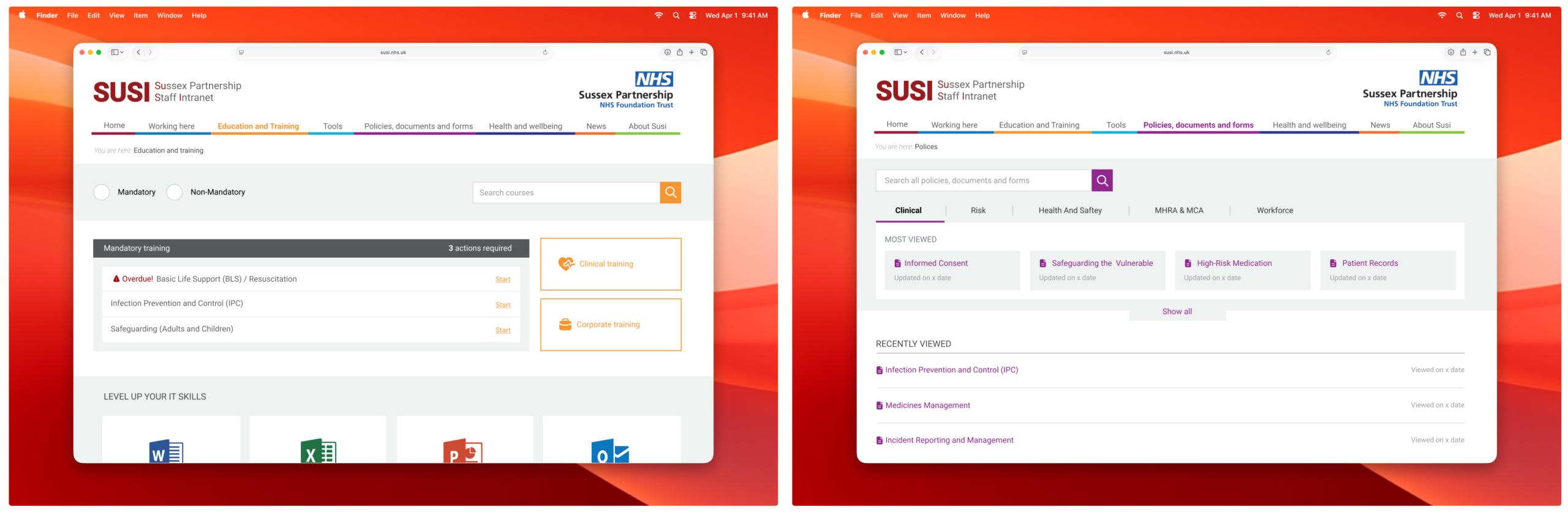
In the same workshop we identified the priority areas and the top three critical use cases each one had to serve. That let me tailor sections of the intranet to individual departments rather than forcing a single homepage to serve everybody equally badly.
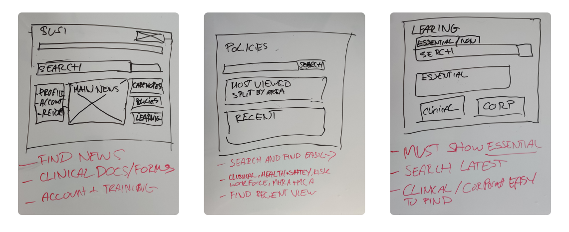
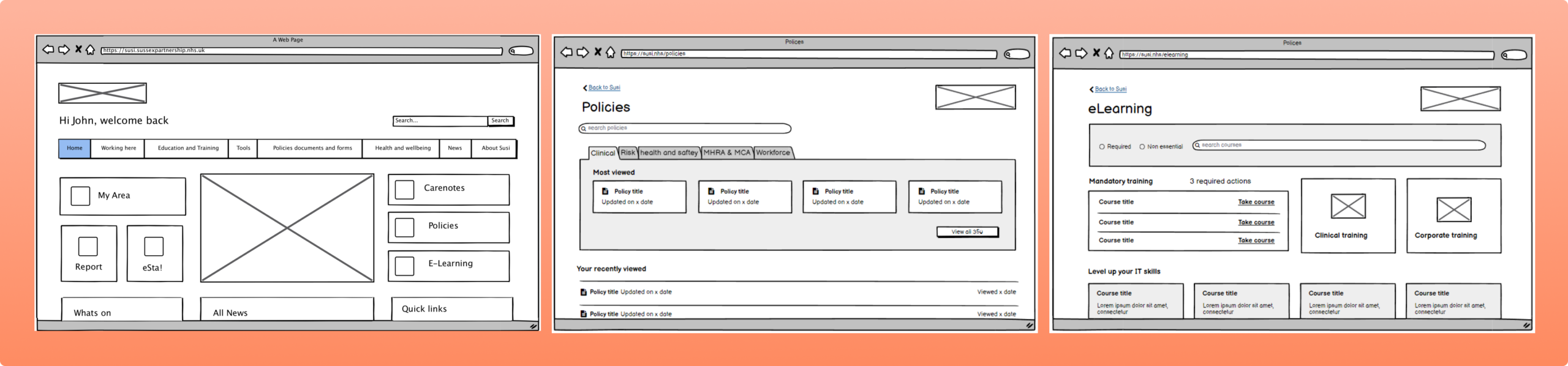
I wireframed the new homepage and the key areas the workshop identified. The brief ran past taxonomy, structure and functionality both needed rebuilding. I guerrilla-tested the wireframes with clinical and corporate staff, which sharpened areas like quicklinks.
Challenge
Twelve years of minor technical updates had left the intranet with no structural ownership. Staff could not find content, and what they did find was frequently out of date.
Some of the old site had to stay reachable. Low traffic did not mean low importance; parts of it were business-critical precisely because they were needed rarely and urgently.
The hardest constraint was access to the people I was designing for. Clinical staff needed to see patients, and research time competed directly with that. So I built a feedback bar into the launch and ran it for the first month, which kept insight coming from front-line staff without taking them away from their work.
Outcome
Visits to the platform rose 40%, and support emails fell by over 20%.
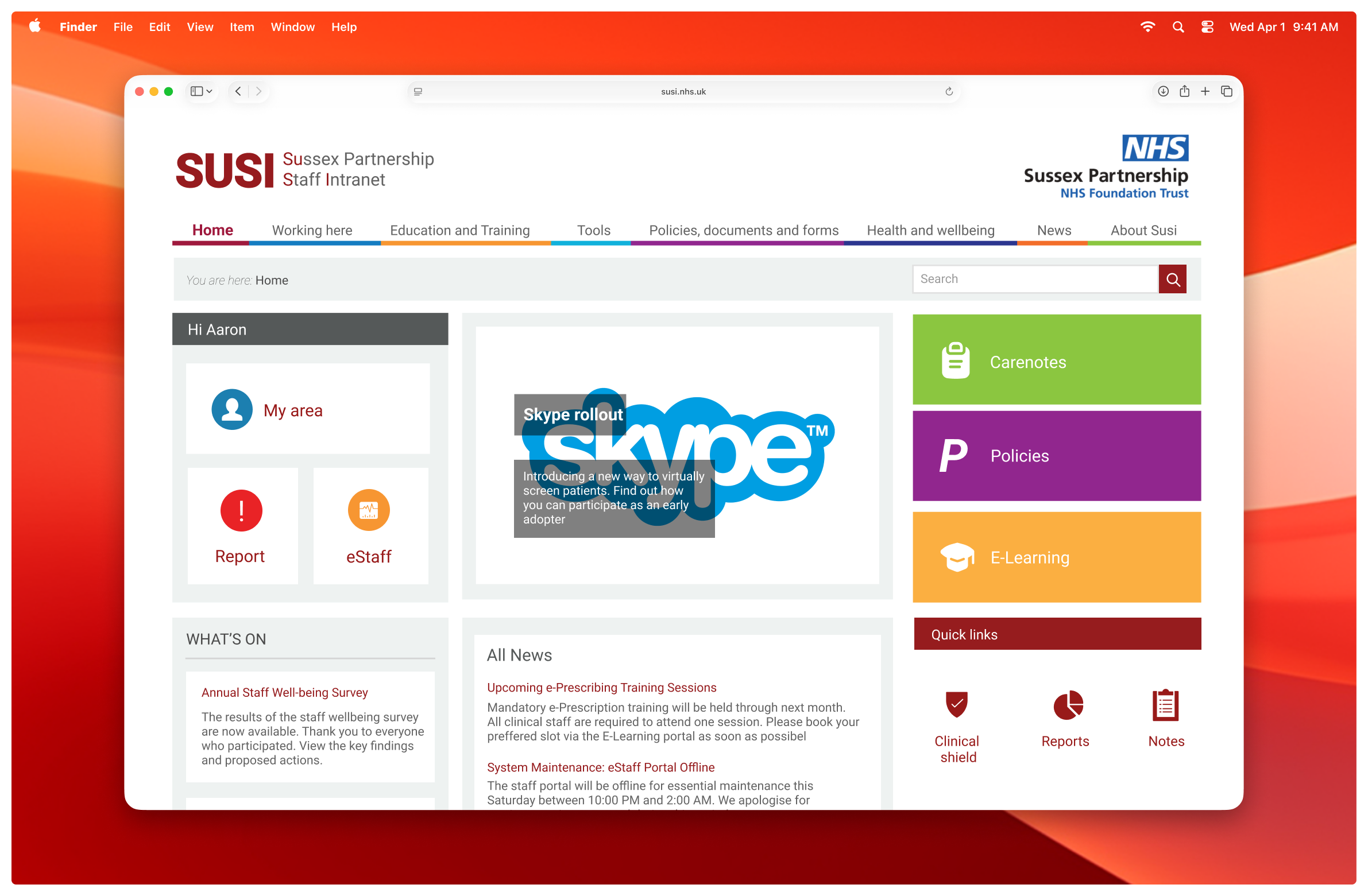
The redesigned site ran on a refined taxonomy with updated content, weighting priority information and high-traffic functions accordingly. I rebuilt search and added filtering, so staff could narrow results rather than scroll through them.
Reference
StepStone
Conversion optimisation
Rebuilt registration around the questions people could actually answer first time