

Elliptic

Product Vision

Elliptic provides blockchain analytics to organisations that need intelligence on crypto activity. Over a decade the product had grown feature by feature, each one answering an individual market demand, leaving it fragmented and increasingly detached from how its users actually worked.

Quarters assigned
0
Increased page visits
0 %
Minutes decision time decreased
0
Users
Compliance analysts and investigators
Ownership
Vision, IA, core analyst flows
Role
Design lead

Approach

I started with the research we already held. Working alongside the Director of Research and Design, I reviewed existing interview recordings to pull out the core jobs customers were hiring the product to do.

One need dominated: analysts had to triage suspected risk and reach a decision on it, fast.

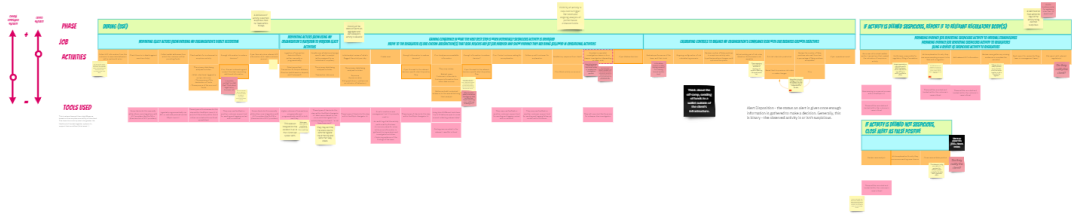
I mapped the existing experience end to end and marked every point of friction against those jobs. Playing this back to founders and stakeholders early earned me their feedback and, more valuably, their buy-in before a single screen was designed.

Experience map used as part of initial product discovery showing core jobs to be done and highlighting key pain points

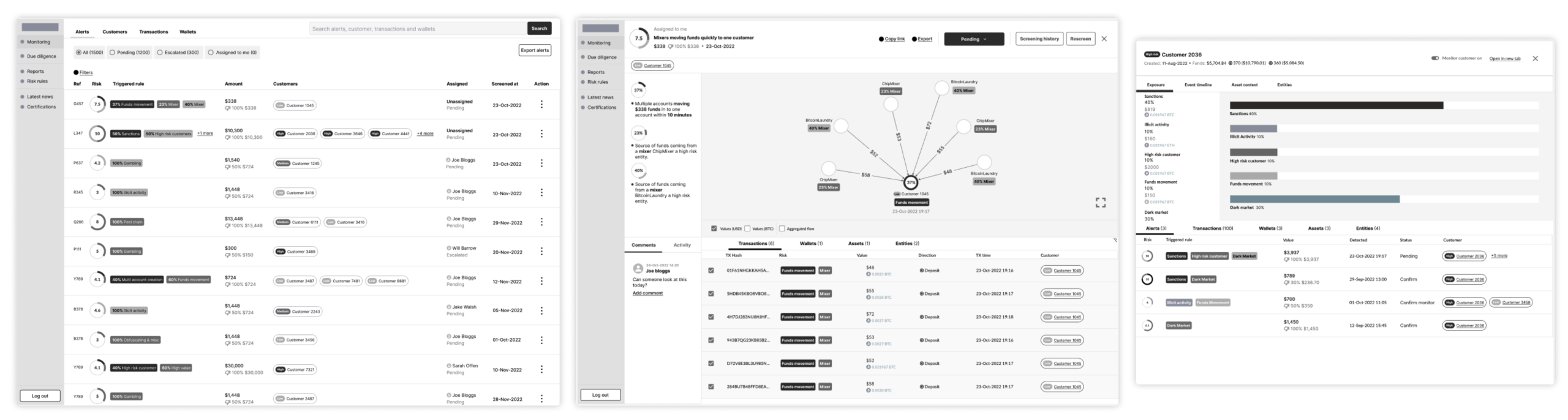
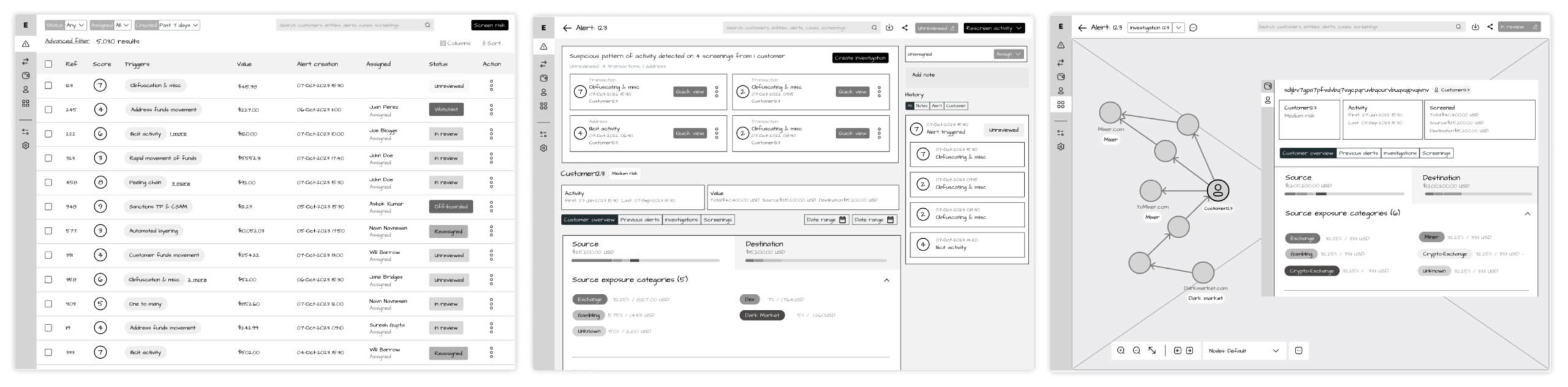
I wireframed a product reorganised around those jobs. Three decisions carried it: an alert model that made triage the primary action, a single view of risk aggregated around an actor on the blockchain, and the ability to set a disposition on suspected risk.

Initial wireframes used in first round of user testing

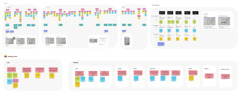
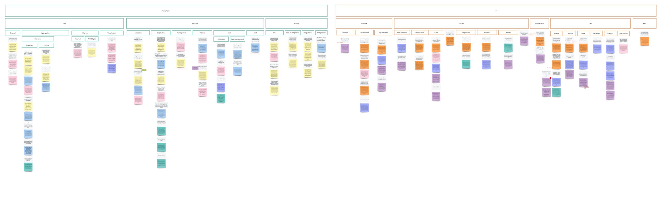
I tested the wireframes with five customers, split between crypto-native businesses and traditional financial institutions. The direction held, and the sessions opened up wider conversations about what frustrated participants in the product as it stood.

Affinity diagram highlighting results of initial user tests

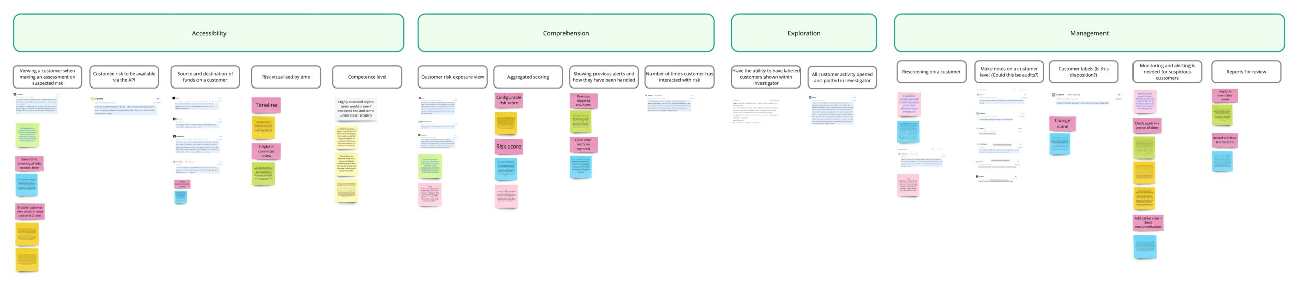
Testing also exposed a gap. My proposal had no detailed view on an actor, and that turned out to be its biggest omission. I went back to the research repository and gathered feedback from the sales team to understand the need properly before redesigning. 

Affinity diagram showing new insights focused on actor view

I redrew the wireframes around a richer actor view and an audit trail of actions taken inside the product, then retested. This round outperformed the first, with users reaching decisions on suspected risk noticeably faster.

Wireframes drawn up for the second round of user testing with improved audit and customer view integrated into the alert

Challenge

Customer access was the hardest constraint. Rather than design around it, I rebuilt our relationship with the customer service teams and started a research community initiative to grow a participant database the team could draw on repeatedly. Where users still weren’t available, subject matter experts kept time-to-insight short.

The vision needed strategic buy-in, so I ran it as an internal roadshow — presenting continually and bringing business leaders into the process early, rather than handing them a finished answer.

All of this ran alongside my roadmap commitments. Balancing the two slowed the initiative at points, and deciding what to defer each sprint was a constant judgement call.

Affinity diagram showing results of user testing highlighting the difference in needs between government and compliance users

Outcome

The business committed a third of its development capacity to this vision for the following four quarters — the clearest measure of whether the work had landed.

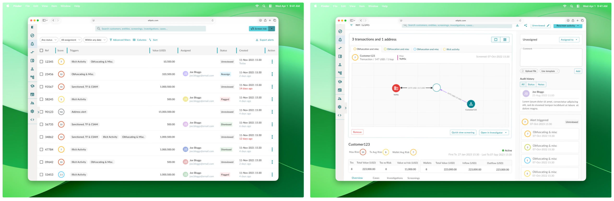
That commitment rested on evidence gathered before the vision was signed off. I ran live on-site tests to build a quantitative case: making the customer view more prominent increased visits to that area by 15% and cut three minutes from the time taken to change a status, confirming our assumption that a customer view is central to assessing risk.

Initial on-site tests with new customer and disposition button to gain quantitative data and baseline metrics for further product improvements

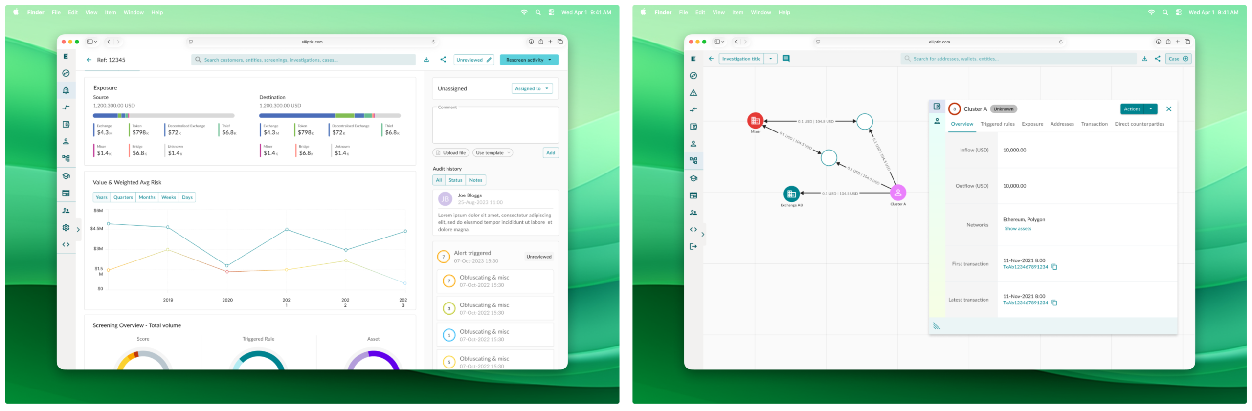
I produced the final mockups as a Northstar vision: an alert model with an auditable view of alert and case handling, a detailed customer view built into the alert itself, and risk visualisation that analysts could craft to evidence illicit activity.

The final user interface showing an alert model and a clearer auditable view of alert and case handling
The final user interface showing a more detailed customer view baked into the alert and the ability to craft risk visualisation to evidence illicit activity

I split delivery into three initiatives: a deeper actor view, disposition tied to a visible audit trail, and greater system interoperability. Sequencing it this way kept the build manageable and let us release value to users incrementally, rather than holding everything back until the full vision shipped.

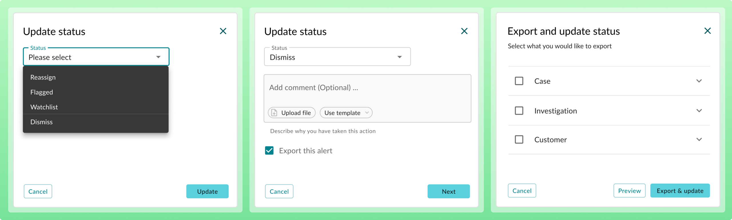
The final design for disposition modal overlay allowing for the audit of decisions and extraction of data for SAR filing

Reference

"Having directly managed Aaron, I found him to be one of the most talented and down-to-earth designers I've worked with. He brings adaptability, strong principles, and care for the products he works on to every project. I'd definitely work with Aaron again and happily recommend him to anyone looking for an empathetic yet results-focused designer. His knack for turning complex goals into intuitive, human-centered solutions is so valuable. He collaborates smoothly across teams by asking thoughtful questions to creatively move projects forward through design. I'd work with him again in an instant!"

Robert Squires
Head of Design
Jobsite

Platform migration

Moved an entire user base across to Totaljobs without losing them along the way