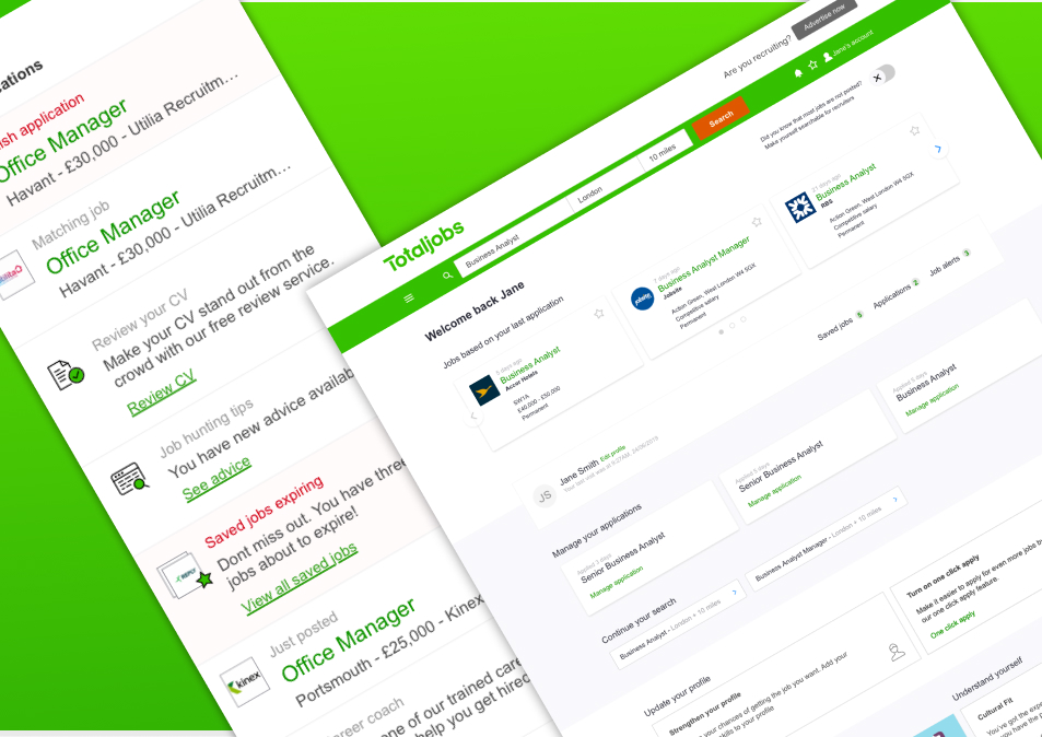
Stepstone is an industry-leading recruitment platform. Driving traffic to the business proved to be a financial strain, and although it generated 10 million weekly visits, it had been identified as a significant factor contributing to revenue loss. We needed to increase the conversion rate of the application form to drive this cost down.
Increase in applications
0%
Increase in registrations
0%
Uplift in apply form conversion
0%
Users
Job seekers applying in the UK and German markets
Ownership
Application journey, form rebuild, testing programme
Role
Senior product designer
Approach
I used the research we already held to shorten time-to-insight, looking for pain points across the journey where evidence already existed. Qualitative and quantitative findings went back to stakeholders at intervals rather than in a single reveal at the end, which kept the direction correctable.
Hotjar recordings and a heuristic analysis showed the form was hard to navigate and failing on accessibility.
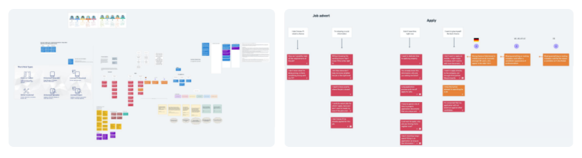
Initial research collected highlighting different user types and observed barriers to applications
I broke the journey into three stages, pre-application, application and post-application and mapped the user flows, marking both where the evidence was strong and where we were still guessing.
User flow of the current application process showing the breakdown of the different stages of the process and suspected user pain-points
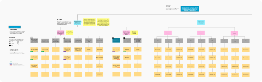
Working with product managers, I used impact mapping to decide which solutions to pursue. It became the deciding tool for what went into user testing and what went into an A/B test.
Impact map dawn up with Product and Engineering leadership to help with discovery-led approach to experimentation
Challenge
The application form was legacy code, over eight years old, and had to be rebuilt from scratch. That put technical architects and engineering leads in the room from the start rather than at handover.
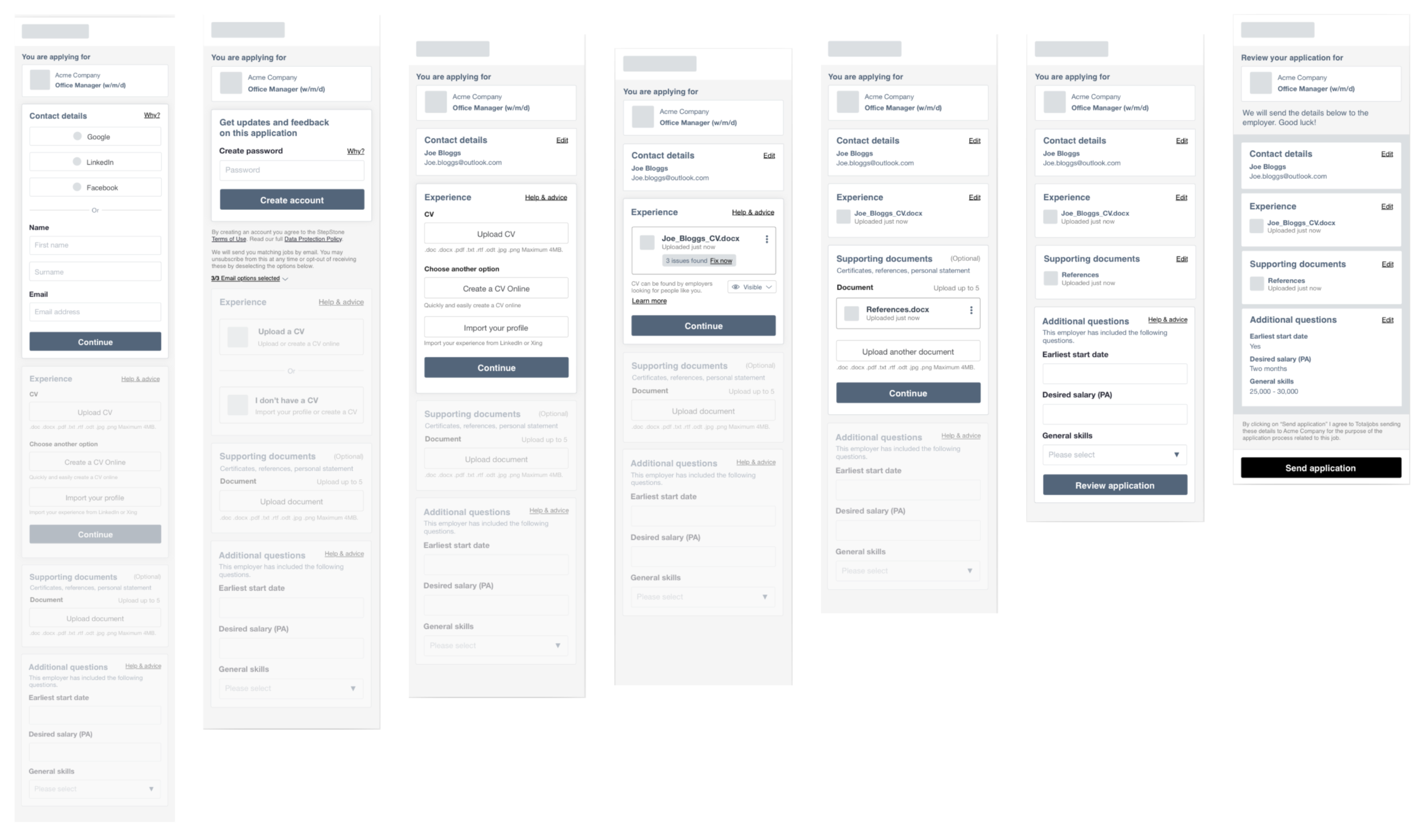
Initial wireframes drawn up for user tests
Testing had to run in German and English. I brought in an agency to speed up recruitment and synthesis in the German market.
German copy frequently ran significantly longer than English, which meant designing several proposals twice. Layouts that held in one language broke in the other, so the reworking was structural rather than cosmetic.
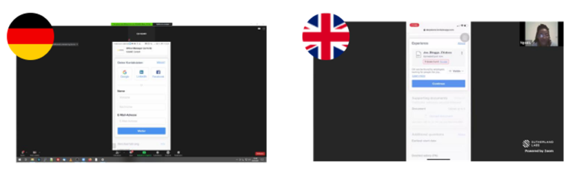
Remote user tests conducted for both the UK and German users
Outcome
Applications rose 16.5%, registrations 12%, and conversion from apply-start to completion 18.6% across the UK and German markets.
Getting there meant separating two different problems. Mobile conversion was significantly weaker, particularly in Germany, where interviews showed users were uneasy about sharing data on a phone and felt a formal application belonged on a desktop.
In the UK the barrier was the CV itself. A fake door test showed the user base would apply without one, plausibly because this audience skews blue-collar, where the expectations around what a job application should look like are different.
Further up the funnel, I A/B tested button colour and copy on the job description page, which produced a 15% uplift in button clicks; around 300,000 users a week. Volume rose, but the form’s own conversion did not, which was the finding that mattered: the problem was inside the form, not in front of it.
The successful button changes used during A/B testing resulting in a significant increase in application start
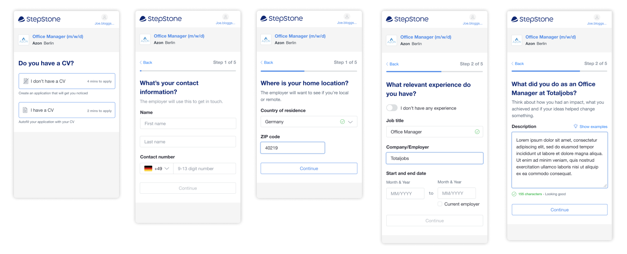
So, I rebuilt the form. Broken into sections, with social logins and the email address captured upfront so abandoned applications could be followed up. That last decision supported what we had already watched users doing, starting on a phone and finishing on a desktop.
Final designs showing new ability to apply without CV with an improved stepped application process allowing users to revisit applications on desktop devices
Reference
"TBC."
Jo Pollet
Senior Product Manager
Totaljobs
Increased engagement
Increased registrations through targeted signposting of content and services