

NHS

Intranet redesign

Sussex Partnership NHS Foundation Trust delivers mental health services to over a million patients a year. Its twelve-year-old intranet left clinical staff unable to find the procedures they needed, or working from out-of-date versions, which created a high clinical risk.

Added to the digital budget each year
£ 0 k
Increased platform visits
0 %
Reduction in support emails
0 %
Users
Clinical and Corporate staff
Ownership
Taxonomy, User Interface, homepage and priority areas
Role
Founding Designer

The problem

Clinical staff couldn’t find the procedures they needed in mental health settings, where a situation can escalate fast.

Sussex Partnership’s intranet had been patched for twelve years with no one owning its structure. When staff needed a procedure, they often couldn’t find it, or found an outdated version.

12 years

Of patches, with no one owning the structure

1m+

Patients a year served by the trust

In mental health hospitals and treatment centres, situations can become volatile quickly. Not knowing which procedure to follow in that moment wasn’t an inconvenience; it was a clinical risk.

The workaround was email. Support inboxes filled with requests to find content, along with reports of pages not loading or breaking.

What we found

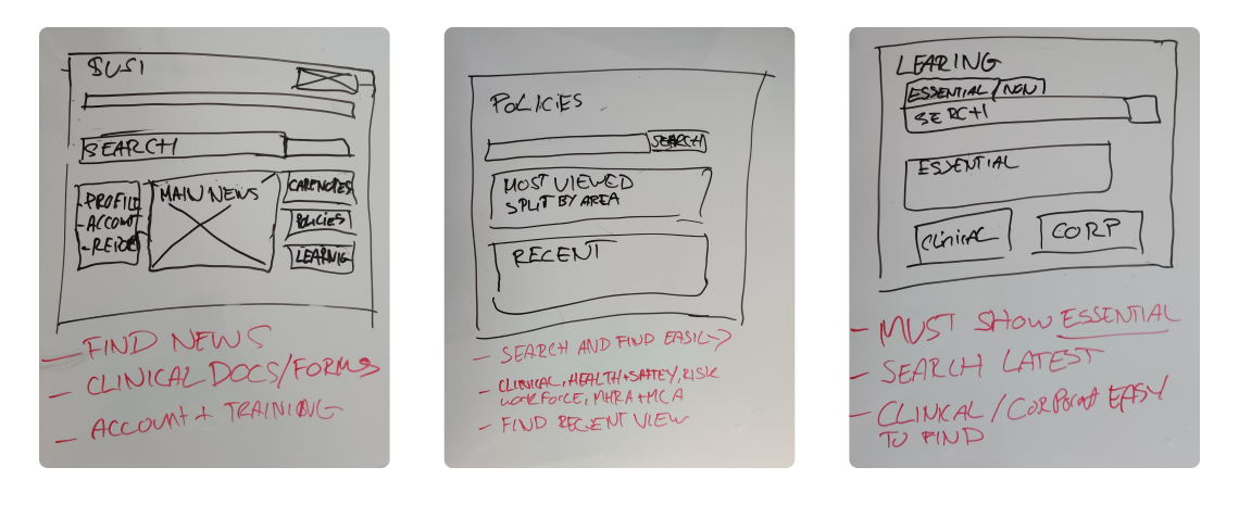
Policies and training were scattered across departments, with no single home for staff to find them.

I mapped the existing site and used Google Analytics to find the high-traffic areas, which gave me a sitemap and an order of priority. I then ran a closed card sort with staff from clinical and corporate services.

The biggest finding was that each department had created its own policies and training, so each department held its own. Nothing lived in one place, and search couldn’t make up for that. What staff needed most was a single, easy route to policies and training.

Card sort: staff needed policies and training in one place, not split by the department that wrote them.

Key findings

Low traffic didn’t mean low importance

Some content was critical precisely because people needed it rarely and urgently.

Every area had its own top three

Each priority area had three critical use cases, so sections needed tailoring by department rather than one homepage serving everyone.

Key decisions

I gave policies and training one home, then tailored the rest around each department’s critical tasks.

Because

I decided

1

Policies and training lived in every department, with no single home

One home for policies and training

The direct answer to the card sort’s biggest finding.

2

Carenotes is where clinical staff sign in to add notes on patients

Carenotes one step from the homepage

A prominent homepage link, treated as a core clinical route.

3

Each priority area had its own top three use cases

Sections built on each area’s top three

Tailored department sections, instead of one homepage serving everyone equally badly.

4

Search couldn’t make up for a scattered structure

Search rebuilt with filtering

Staff can narrow results instead of scrolling through them.

5

Low traffic didn’t mean low importance

Rarely used critical content kept reachable

Low-traffic pages weren’t cut on traffic alone.

Early homepage drafts: the department-first structure was replaced with the use cases each area actually needed.

What I left out

A responsive layout. Staff had been issued Android phones and tablets, but months later they rarely used them and did most of their work at a computer. We put that down to IT confidence, so responsive was deferred and the first release focused on the desktop.

Testing in the field

Testing in the field showed that ease of navigation had to come before everything else.

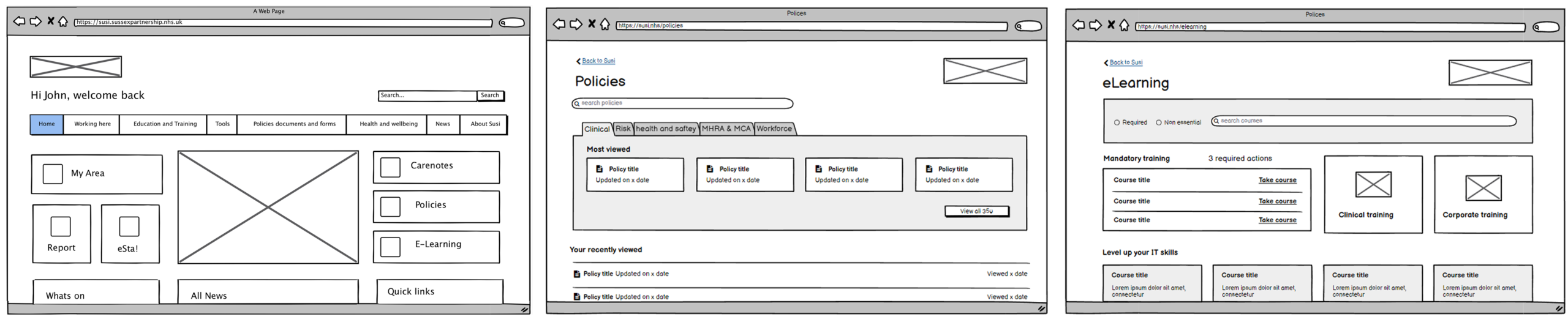
I guerrilla-tested the wireframes with clinical and corporate staff, and it changed more than the UI. Being out in the field showed me who I was really designing for: a high proportion of staff weren’t confident with IT, and many were approaching or over 60.

Ease of navigation came first, and I gave the key areas extra weight on the homepage so they were impossible to miss.

Wireframes taken into the field: testing showed that many staff weren’t confident with IT, so navigation had to be obvious at a glance.

Challenges

The people I was designing for were the hardest to reach, and the budget was even tighter.

Access to clinical staff

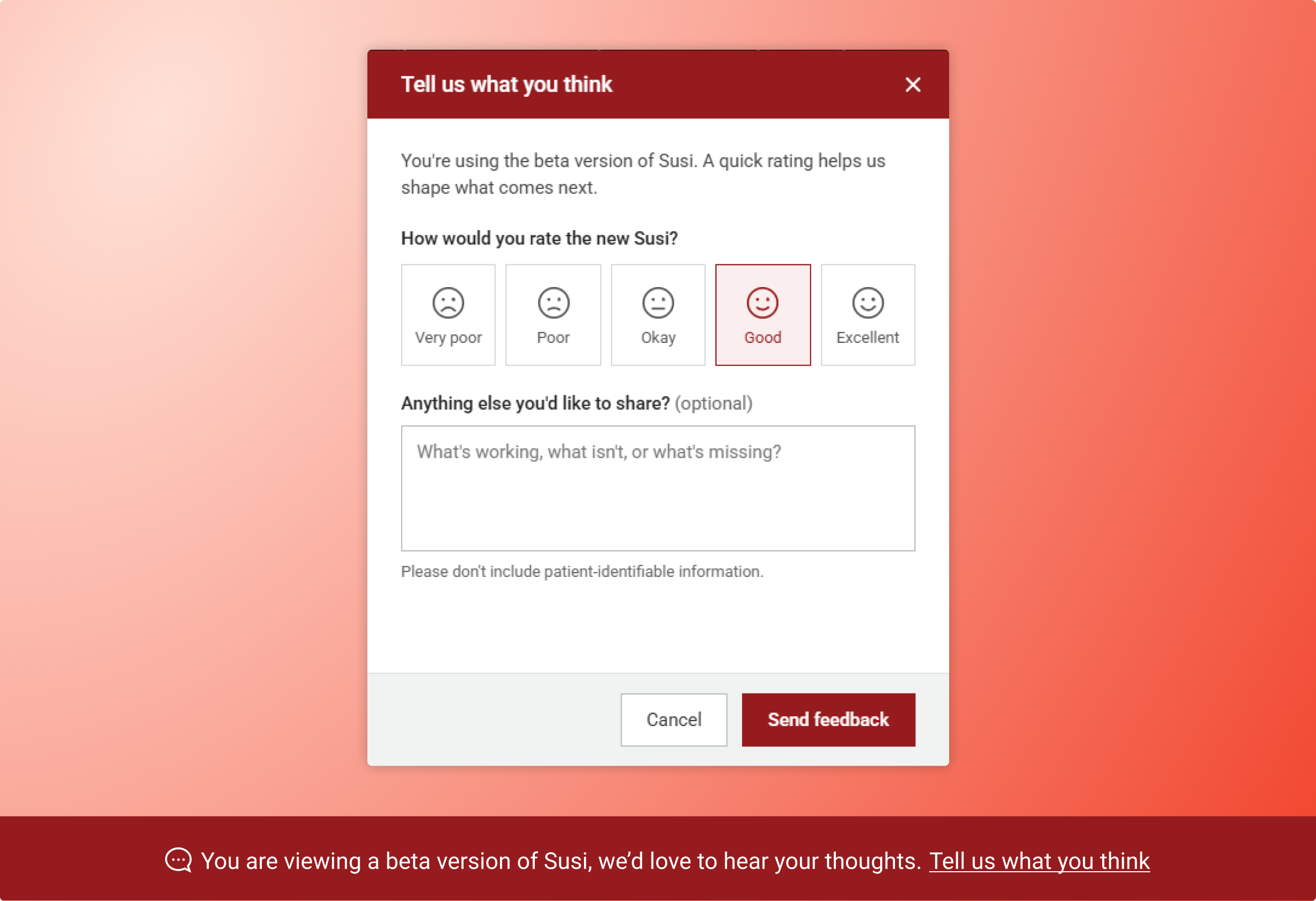
Research time competed with patient care, so I built a feedback bar into the launch and ran it for the first month. That kept front-line insight coming in without taking staff away from patients.

Budget for ongoing development

An agency built the site, but there was little money left for ongoing development, so I made front-end code changes myself. I then presented to NHS leadership on digital transformation, using the intranet’s results as the case study for change. Every department agreed to contribute to a shared pot for digital work, increasing my team’s budget by £200k a year.

Instead of pulling clinicians away from patients, a feedback bar kept front-line insight coming in for the first month after launch.

Final designs

Policies, training and Carenotes front and centre, with search that could narrow results.

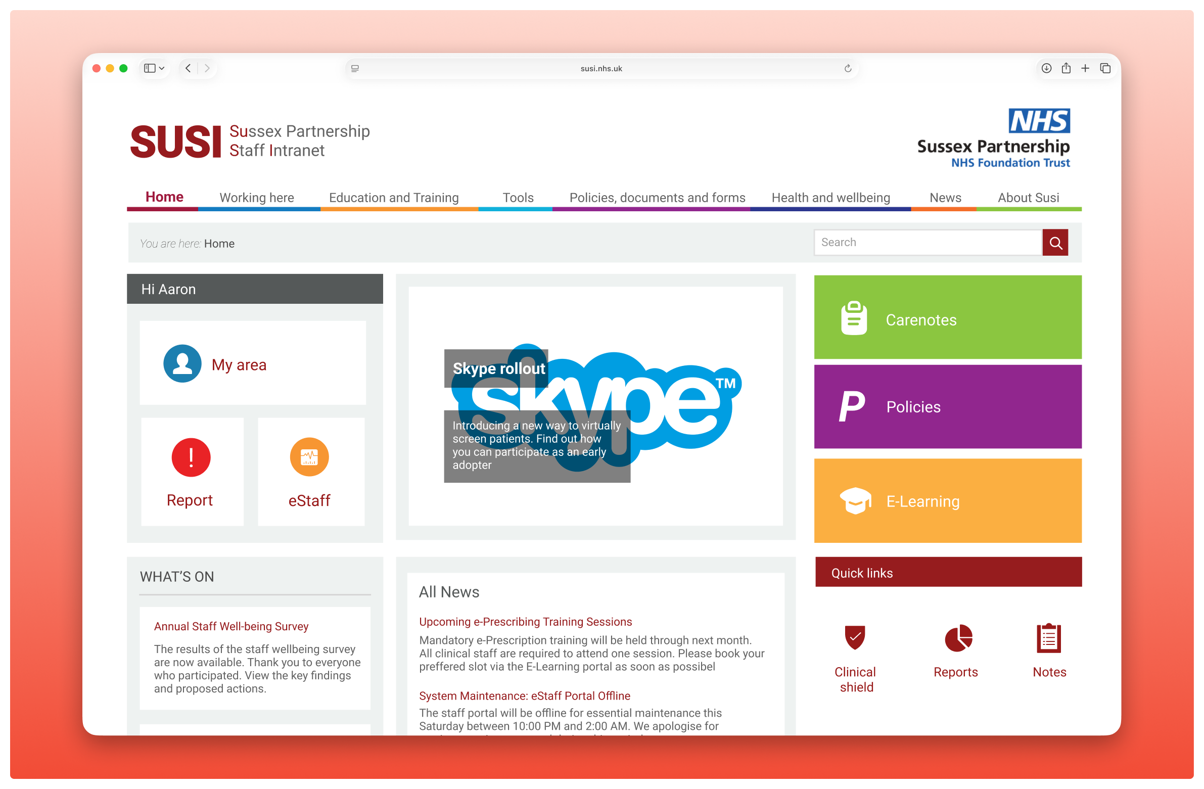
The new intranet ran on a refined taxonomy with updated content, and the homepage gave the most prominence to priority information, high-traffic functions and the Carenotes sign-in.

Final homepage: Carenotes and the key areas were given the most weight, so less IT-confident staff could find them at a glance.

I rebuilt search and added filtering, so staff could narrow results instead of scrolling through them.

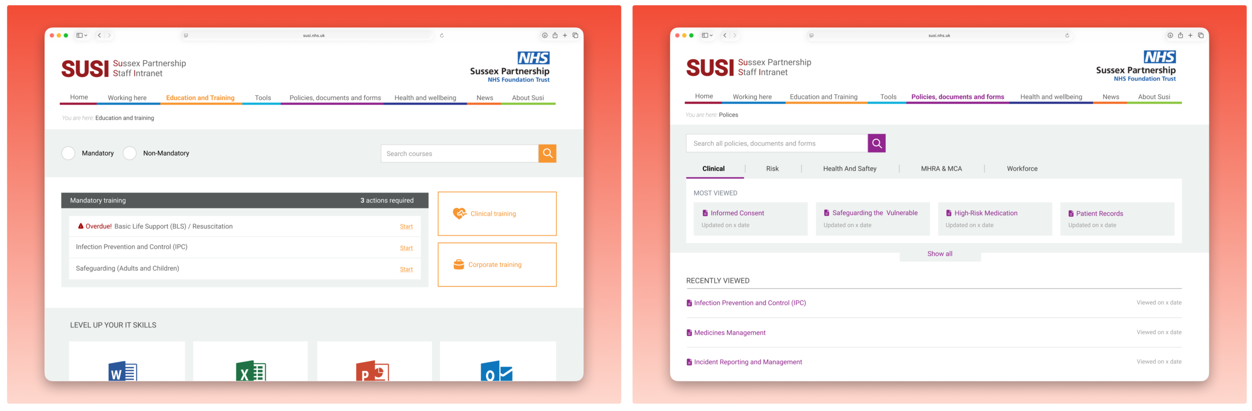
Policies and training brought into one home, answering the card sort’s biggest finding.

Visits to the platform rose 40% and support emails fell by 20%. Together, those results secured an extra £200k a year for digital work.

Recommendation

"Aaron came to work for Sussex Partnership straight from University. I was really impressed with his drive, talent and work ethic. Aaron was extremely self-motivated, keeping abreast of the latest UX thinking, which massively contributed to the quality of the digital products delivered."

Theresa Jones
Head of IT Solutions and Delivery

Totaljobs

User reactivation

Brought 1.6M candidates back to Totaljobs with cohort-based email campaigns.

Dormant title image