


StepStone

Conversion Optimisation

StepStone is an industry-leading recruitment platform, connecting job seekers with employers across the UK and German markets.

Increase in applications
0 %
Increase in registrations
0 %
Uplift in apply form conversion
0 %
Users
Job seekers applying in the UK and German markets
Ownership
Application journey, form rebuild, testing programme
Role
Senior product designer

The problem

We needed to optimise the traffic Stepstone paid for and convert them into applications

StepStone spent heavily to bring job seekers to the site, and it worked: 10 million visits a week. But too many of those visitors left before applying. Some dropped off on the job details page without ever starting an application. Others started the form and never finished it. 

The goal was to maximise the application rate of the traffic we were already paying for, so each application cost the business less.

10m
Visits a week, paid for to bring job seekers in
Job details page
Leak 1
Left without starting an application
Application form
Leak 2
Started the form, never finished it
Application
What the traffic was paid for

What we found

Job seekers hesitated before they even started, and the data pointed to mobile, where most of our traffic came from, converting the worst.

I started with the research we already held, plus Hotjar recordings and a heuristic analysis, to find pain points where evidence already existed. The recordings showed people hesitating to start an application at all. Once inside, the form was hard to navigate and failed on accessibility.

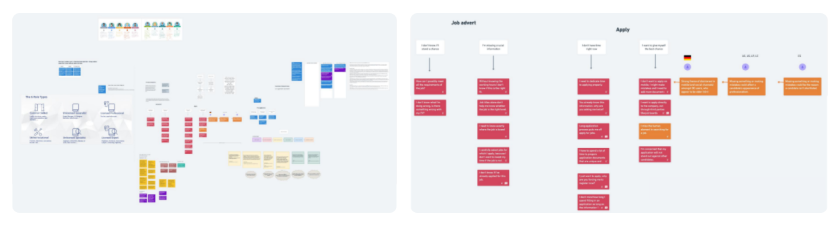
Existing research, grouped in an affinity map, pointed to hesitation before starting and a form that was hard to navigate.
67%

Of traffic came from mobile

Fewer applications

Mobile produced far fewer applications than desktop

I mapped the journey across three stages, marking where the evidence was strong and where we were still guessing.

Stage 1

Pre-application

Stage 2

Application

Stage 3

Post-application

Mapping the current UK form against assumed jobs to be done showed where pain points were likely, and where we were still guessing.
Working hypothesis

The CV was a barrier to applying, particularly on mobile, where most people don’t have one to hand.

Key decisions

We treated the two leaks as two different problems, testing small changes live and big changes with users.

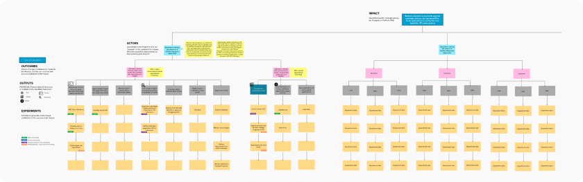
Working with product managers, I used impact mapping to decide which solutions to pursue. It also decided how each would be tested: user testing for bigger changes, A/B tests for smaller ones, ensuring an evidence based approach.

Impact mapping ranked each idea and decided whether it went to user testing or an A/B test.
i.

Test the front door first

Hesitation started on the job details page, so button colour and copy went into an A/B test: a cheap way to find out whether the drop-off was about getting people started.

ii.

Rebuild the form mobile-first

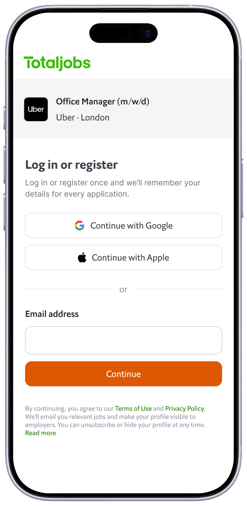
With 67% of traffic on mobile, the form was broken into sections, with social logins and the email captured upfront so abandoned applications could be followed up.

iii.

Make the CV optional, not gone

Users could apply by entering their experience instead of uploading a document, lowering the barrier without taking the CV away from those who had one.

What I left out

Desktop and email reminder notifications. We knew some users started on mobile and picked back up on desktop, but we chose to reduce failed mobile applications first. Capturing the users who would always stubbornly apply on desktop was the next phase, and capturing the email upfront laid the groundwork for it.

Testing and iteration

Clicks rose 15%, but the form’s conversion didn’t move, proving the problem was inside the form.

A/B testing the front door

I A/B tested button colour and copy on the job details page, using a more positive colour, distinct from the current branding, and copy that felt less daunting. The test was a success and more people started an application, but the same share gave up.

+15%

Button clicks

~300k

Users a week in the test

Flat

Form conversion

The winning button lifted clicks 15%, but form conversion held flat, pointing the work at the form itself.

Fake door testing the apply without CV

In the UK, a fake door test showed users would happily apply without a CV, plausibly because the audience skews blue-collar, where expectations of a job application are different.

User testing the new flow across the two markets

I tested with five users in each market, in German and English. In Germany, interviews showed users were uneasy sharing data on a phone and felt a formal application belonged on a desktop. That reinforced the start-on-mobile, finish-on-desktop pattern.

What changed: one form, two markets

Testing showed a single form couldn’t serve both markets and we would need to localise based on the observed behaviours of both.

Sign-in

German users didn’t want to sign in with Google. Manual sign-in became primary in Germany, while “Sign in with Google and apply” led in the UK.

Documents

German users were less keen on applying without a CV, and wanted to add certificates and references. The German form gained an optional upload for extra documents.

Complexity

On mobile, too many steps and fields were visible at once. I broke the form into clearer more focused steps.

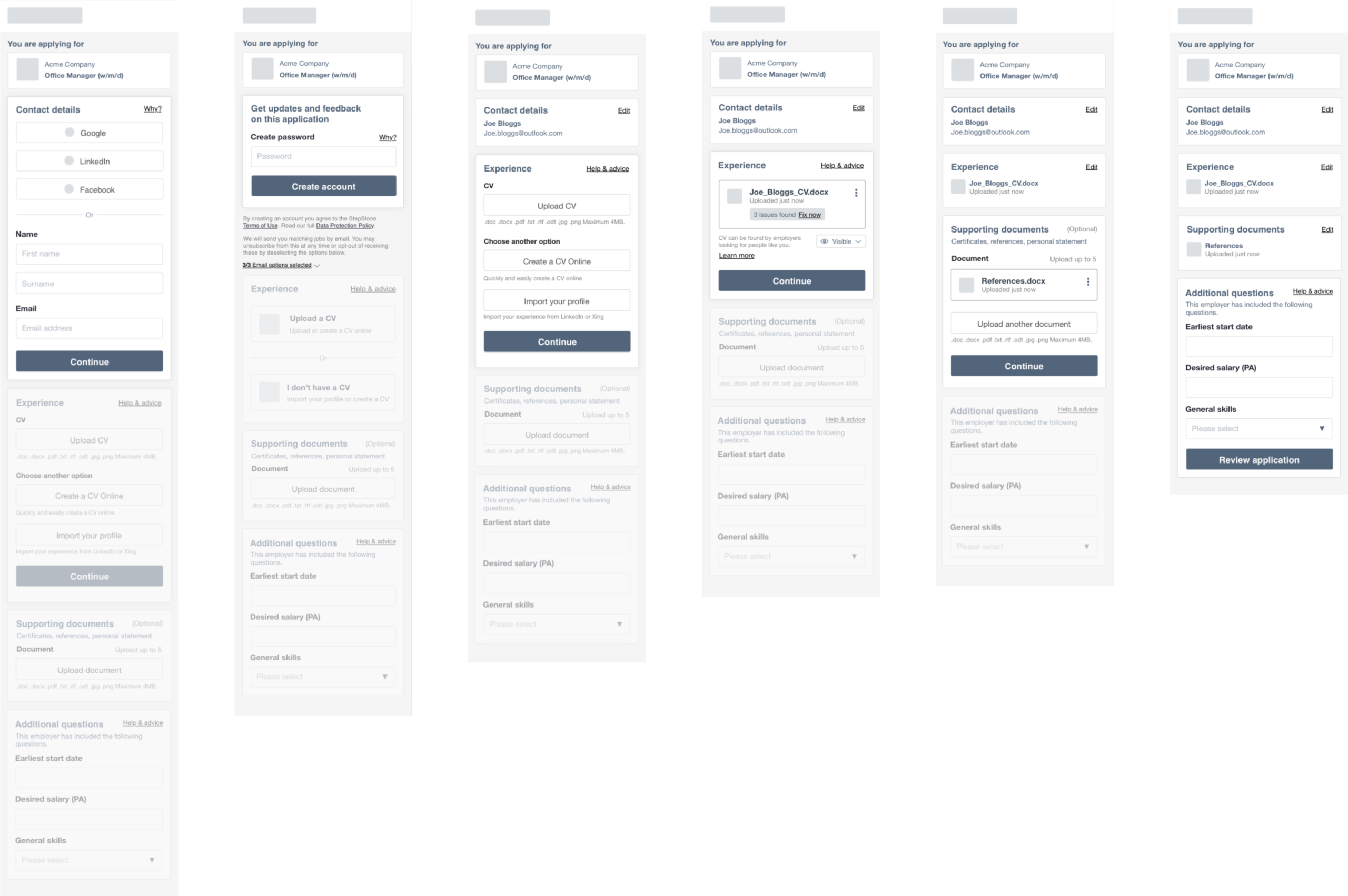
Wireframe testing showed German users wanted manual sign-in and extra documents, and mobile needed fewer fields per step.

We tested at wireframe stage only, to remove any potential existing association with the brands. The stepped, market-split form went from there into build and the live release, where the numbers became the final test.

Challenges

Rebuilding an eight-year-old form for two markets meant the UK starting point couldn’t shortchange Germany.

Legacy code

The form was over eight years old and had to be rebuilt from scratch. I brought technical architects and engineering leads in from the start, not at handover.

One form, two markets

The new form replaced Germany’s existing one, but started from the UK form. I tested in both markets and split sign-in and document upload so Germany was properly served, not just translated.

Two languages to test

Research had to run in German and English. I brought in an agency to speed up recruitment and synthesis in Germany.

Longer German copy

Layouts that held in English broke in German. I designed key proposals twice, and the fixes were structural, not cosmetic.

Final designs

A stepped, market-aware form lifted apply form conversion by 18.6%.

The final form was broken into clear steps with progressive disclosure, and questions were reordered so users answered the simplest first. The email was captured upfront so abandoned applications could be followed up later.

Registration, split by market

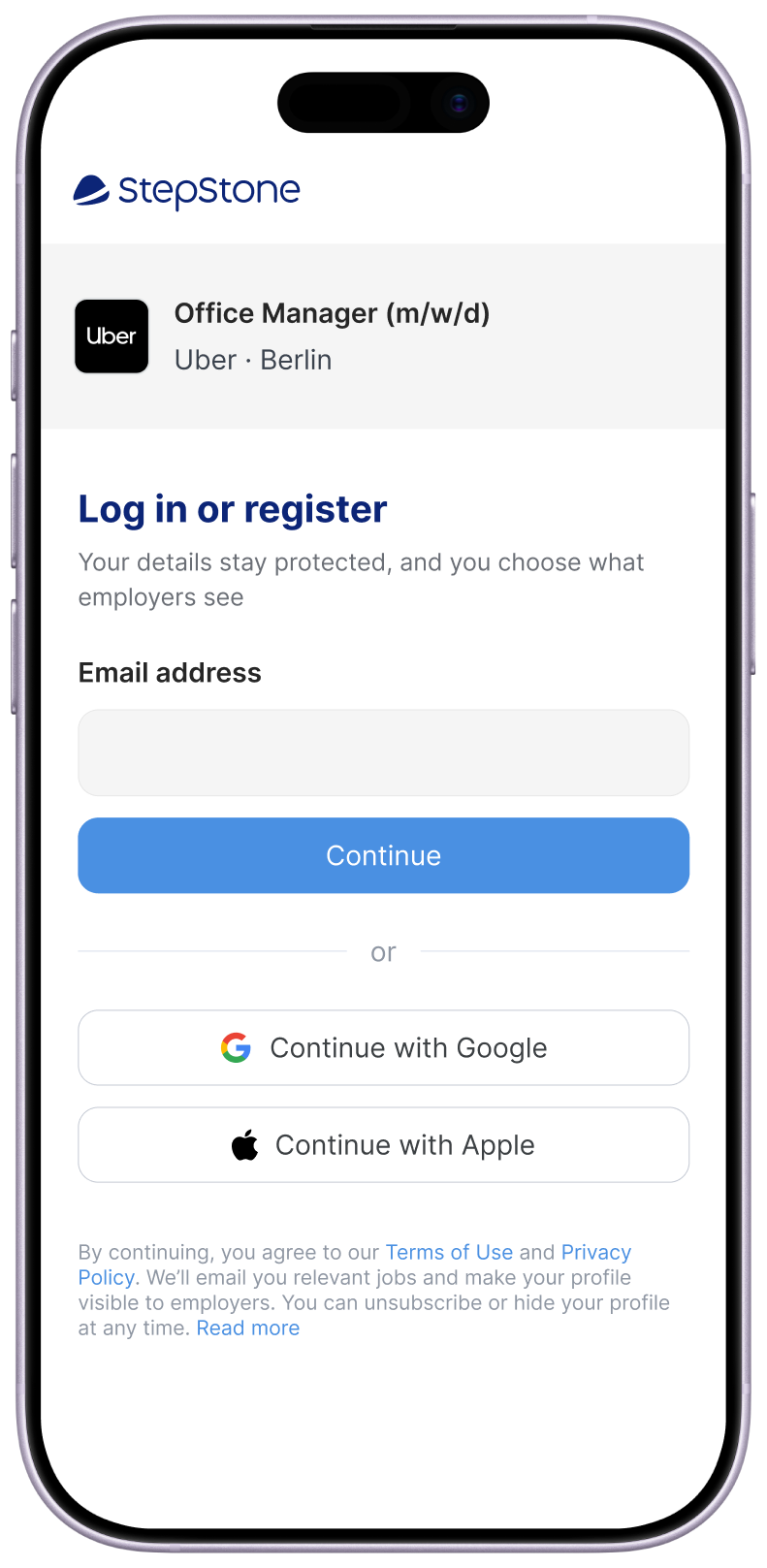
Testing showed one registration couldn’t serve both markets. Germany went manual-first, the UK gave priority to social logins.

Apply without a CV, one short step at a time

Users could apply by entering their experience instead of uploading a CV. German users could also add certificates and references.

Removing the need for a CV and breaking the form into stepped conversational questions

Applications rose 16.5%, registrations 12%, and apply form conversion 18.6% across the UK and German markets.

Recommendation

"I have had the pleasure of managing and working closely with Aaron, and I can confidently say that he is an incredibly talented and innovative product designer. He is truly passionate about creating user-centered experiences that not only delight but also inspire. Aaron has a keen eye for detail, a deep understanding of design principles, and a relentless drive for excellence that consistently elevates his work. I would work with again in a heartbeat."
Joe Willet
Lead Product Designer

Jobsite

Platform Migration

Moved an entire user base across to Totaljobs without losing them along the way.